Pictures!
Here is one of the projects that I've been teaching lately. I designed these placemats for the autumn theme of class this semester. The background is strip pieced and was a good beginner lesson. Last week I taught how to make the lightly padded pumpkins and the 3-D stems. This week we'll be covering the vines and leaves.
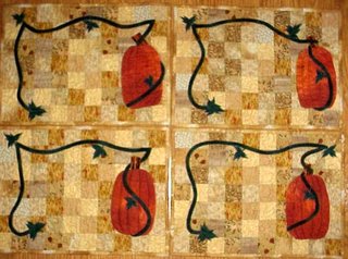 Notice how each placemat is different? I think they're more fun and definitely easier that way!
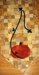
 Here's a cloesup of the pumpkin on the table runner. Pretty fat and sassy, huh?
 This is my latest work. I'm trying to put together some of my favorite 3-D techniques for a totebag workshop. I love teaching the curvy bias totebag, but my 3-D jacket is another big hit in the fashion show and it's always nice to have another option for a guild workshop.
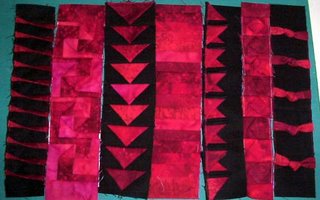 The only problem is that I'm not particularly happy with how they look together. I had orginally planned to have some techniques on one side of the totebag and some on the other. Only 3 or 4 techniques on each side look a bit bare though. And 6 or 7 would be the most I could hope to teach in a 6 hour workshop. So I think I'm may have to revise my plan and only put the 3-D techniques on the "front" of the totebag (or let them repeat the same ones for the back). In this case I think 5 techniques would be better, but I don't know which ones to toss out. They're all fun! Any suggestions?
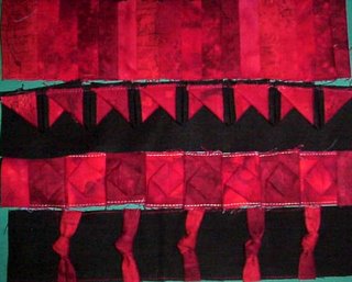
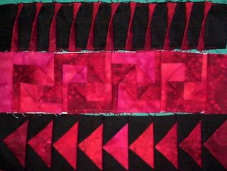 Here are a couple of close ups of the techniques I have so far. I had planned on black seperator strips, but now I'm not so sure. Any suggestions would be greatly appreciated!
 Notice how each placemat is different? I think they're more fun and definitely easier that way!
 Here's a cloesup of the pumpkin on the table runner. Pretty fat and sassy, huh?
 This is my latest work. I'm trying to put together some of my favorite 3-D techniques for a totebag workshop. I love teaching the curvy bias totebag, but my 3-D jacket is another big hit in the fashion show and it's always nice to have another option for a guild workshop.
 The only problem is that I'm not particularly happy with how they look together. I had orginally planned to have some techniques on one side of the totebag and some on the other. Only 3 or 4 techniques on each side look a bit bare though. And 6 or 7 would be the most I could hope to teach in a 6 hour workshop. So I think I'm may have to revise my plan and only put the 3-D techniques on the "front" of the totebag (or let them repeat the same ones for the back). In this case I think 5 techniques would be better, but I don't know which ones to toss out. They're all fun! Any suggestions?
 Here are a couple of close ups of the techniques I have so far. I had planned on black seperator strips, but now I'm not so sure. Any suggestions would be greatly appreciated!


3 Comments:
Sounds like life is creative, busy and fun! I am so happy for you.
I like the idea of black separater strips, but I'm sure you'll audition some options and see what feels right. You have good design instincts, so I'm sure whatever you come up with will look great. Jen
My two favorites are the 2nd and 3rd down in the first grouping...but I can see why you are having a hard time eliminating!
These look fantastic and will be great on a tote bag. I think your right about limiting the number you use and what a dilemma that is!
I love the black and red color combo. As for which ones I like best, well, I think your going to need to make more then one totebag...( helpful right?..lol) The idea for black sashing would work but I think I like them without it.This is just my thoughts on it but your knack for putting it all together will be wonderful Im sure!
Post a Comment
<< Home